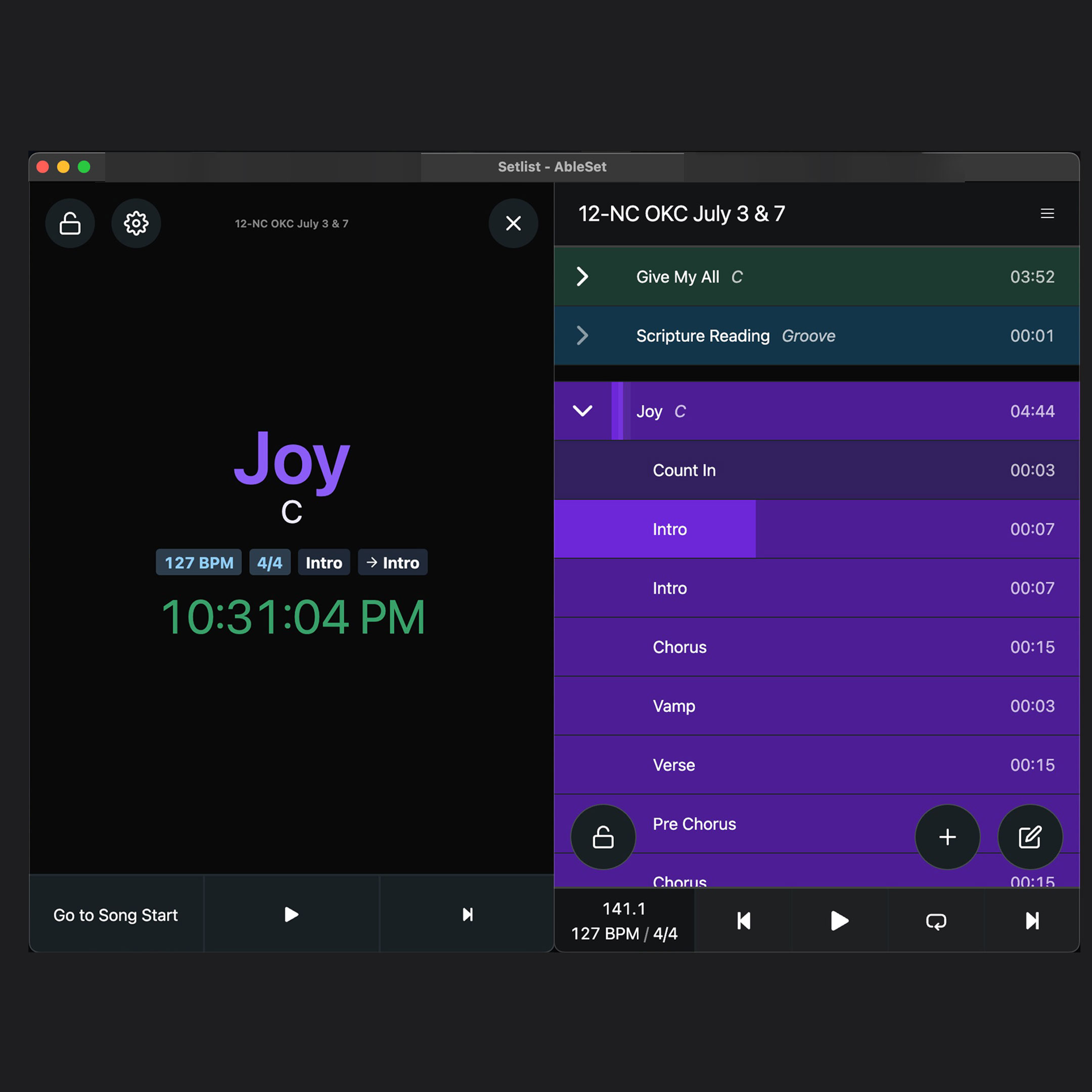
So this may have been requested in the past and I haven’t seen it but, what would be the possibility of viewing the performance view & setlist view side by side? Similar to viewing Lyrics and Performance.
I know the section progress bar is there but there is something comforting to me about viewing it vertically. I am attaching a very rough mockup and what I am thinking. Obviously the bottom bar buttons would need to be re-done but I really like the idea of the Performance style large text indicating what song is selected, and the vertical view of the setlist.
I know it’s possible with OSC, but it would be cool to have it built-in to Ableset (to minimize the number of “moving pieces”). You could open a couple browser windows and place them side by side
Hey @calebstephen, thank you for your feature suggestion!
This is something I could implement in the future. Since AbleSet already supports lyrics in the performance view, it makes sense to support the setlist as well. Would you prefer a 50/50 split or would it be enough to make the setlist a bit more narrow, e.g. 67/33?
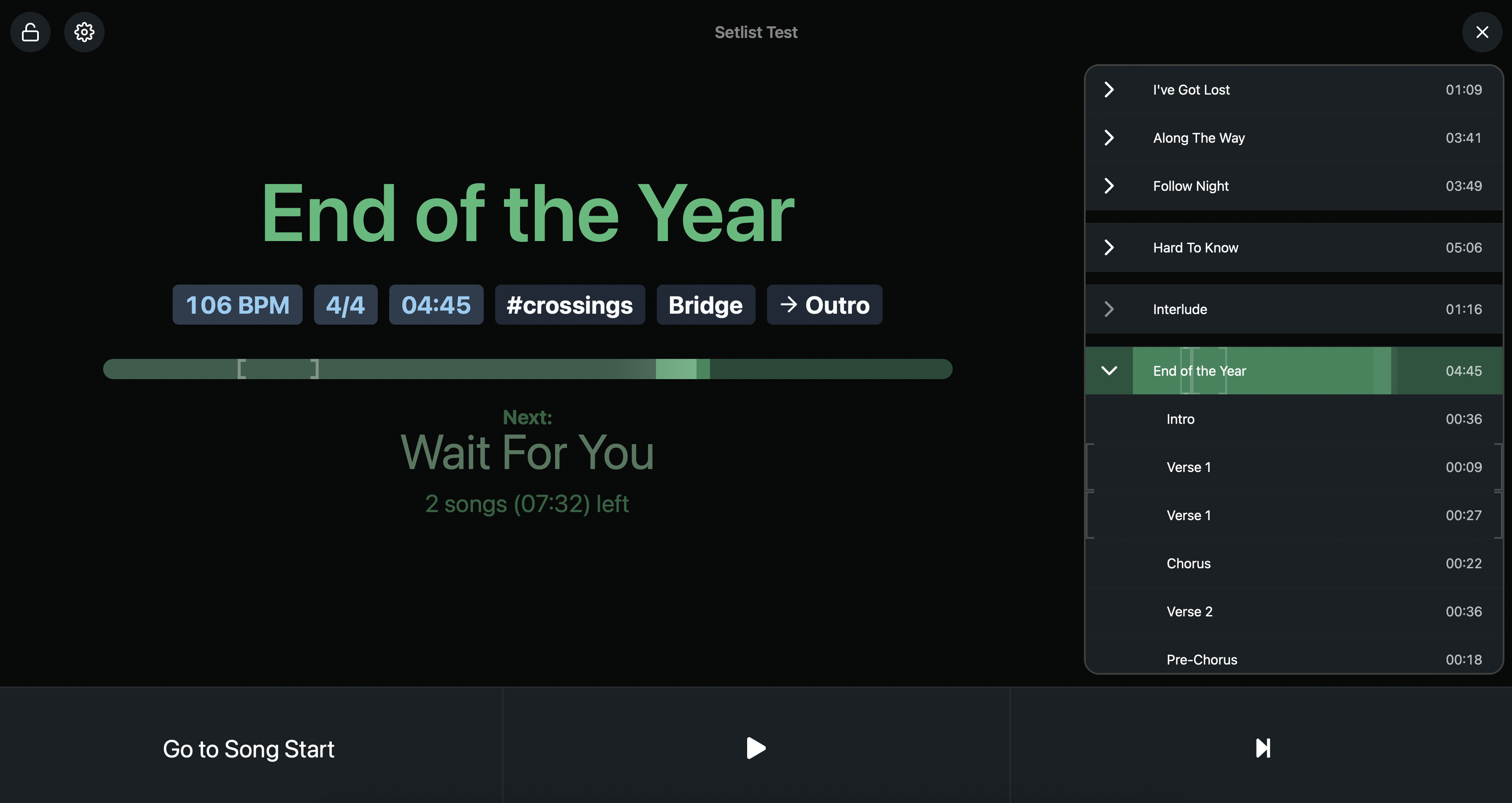
For now, it just roughly takes up 1/3 of the screen’s width with a maximum width of 600px and a minimum width of 400px. Would you like the setlist to be a different size?
I figure it depends on the use case; a 50/50 would be useful in my case (off-stage playback engineer that just wants a clean view of everything), but not necessarily for people that are using the performance view while performing on stage. If that makes any sense. Whatever ratio you settle on, I’ll be using the dual view either way
As of now, you can’t remove the performance information elements of the performance page with a toggle, but if you only want to see the lyrics and setlist view, you could use custom CSS to hide the information elements like this:
After using this for a bit and really loving it, I have some feedback on window sizing. It would be great to be able to target it in the CSS to adjust the width depending on the use case.
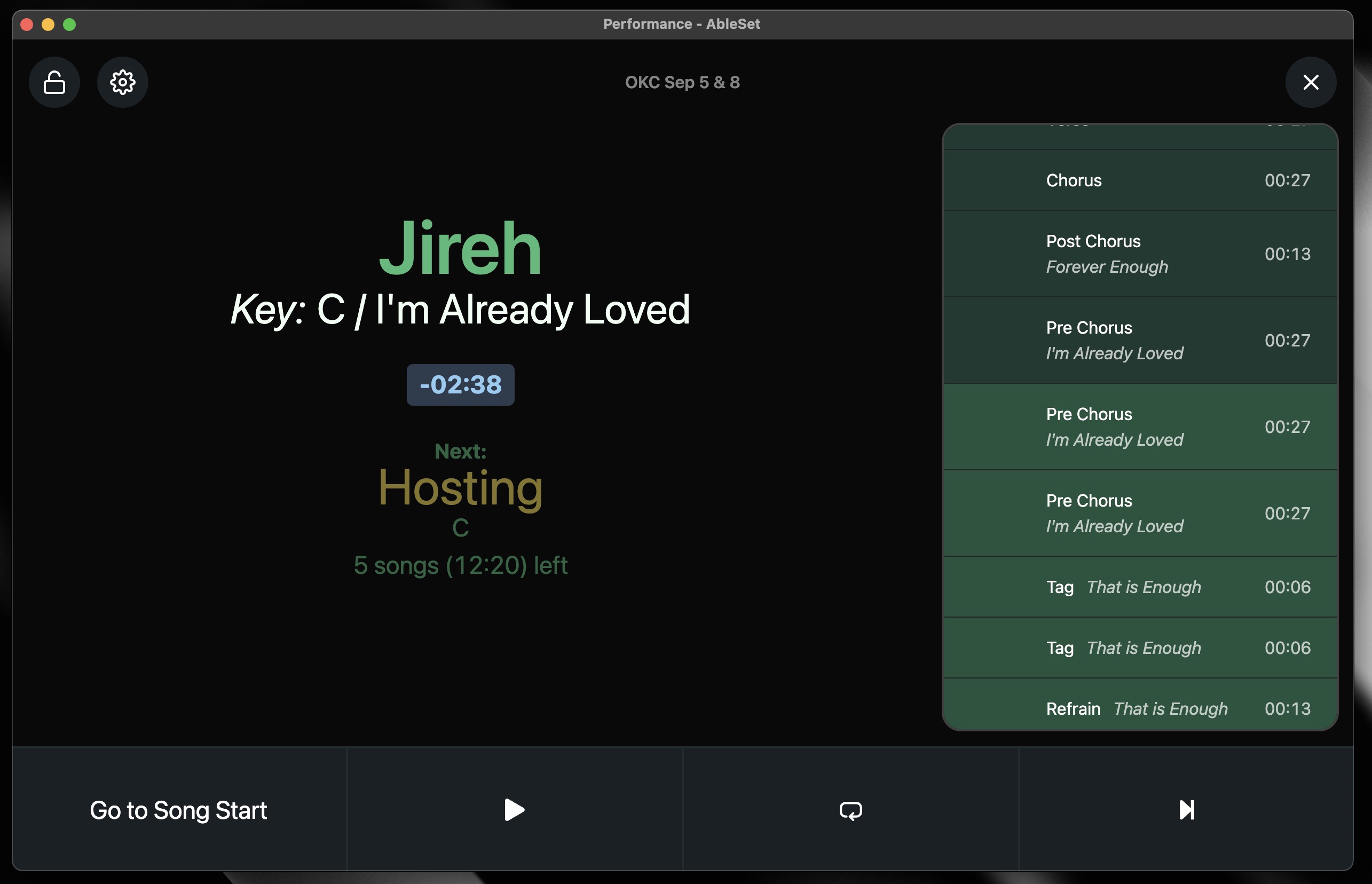
At my church, I frequently use the Cue Descriptions so that my MD can see notes or reminders about specific sections. For example, if something has a 1 or 2-measure count-in, or if there’s a song with 4 bridges, each with different lyrics, I’ll include the first part of each line as a reference point. This way, my MD doesn’t need to see all the lyrics, just the key parts.
However, I’ve encountered a few situations where the split view window is too small, causing text to break awkwardly. While it’s not a major issue, I would prefer if the information consistently appeared in the same location. Currently, it sometimes aligns with the section name and other times appears underneath it. Photo below for reference.
In this example, I have ample screen real estate available in performance view and would love to allocate some of it to Setlist. I realize this is a minor quality-of-life improvement request.
Leo, you’re truly the best for listening to your users and implementing features! I think I speak for many of us when I say THANK YOU SO FREAKIN MUCH!