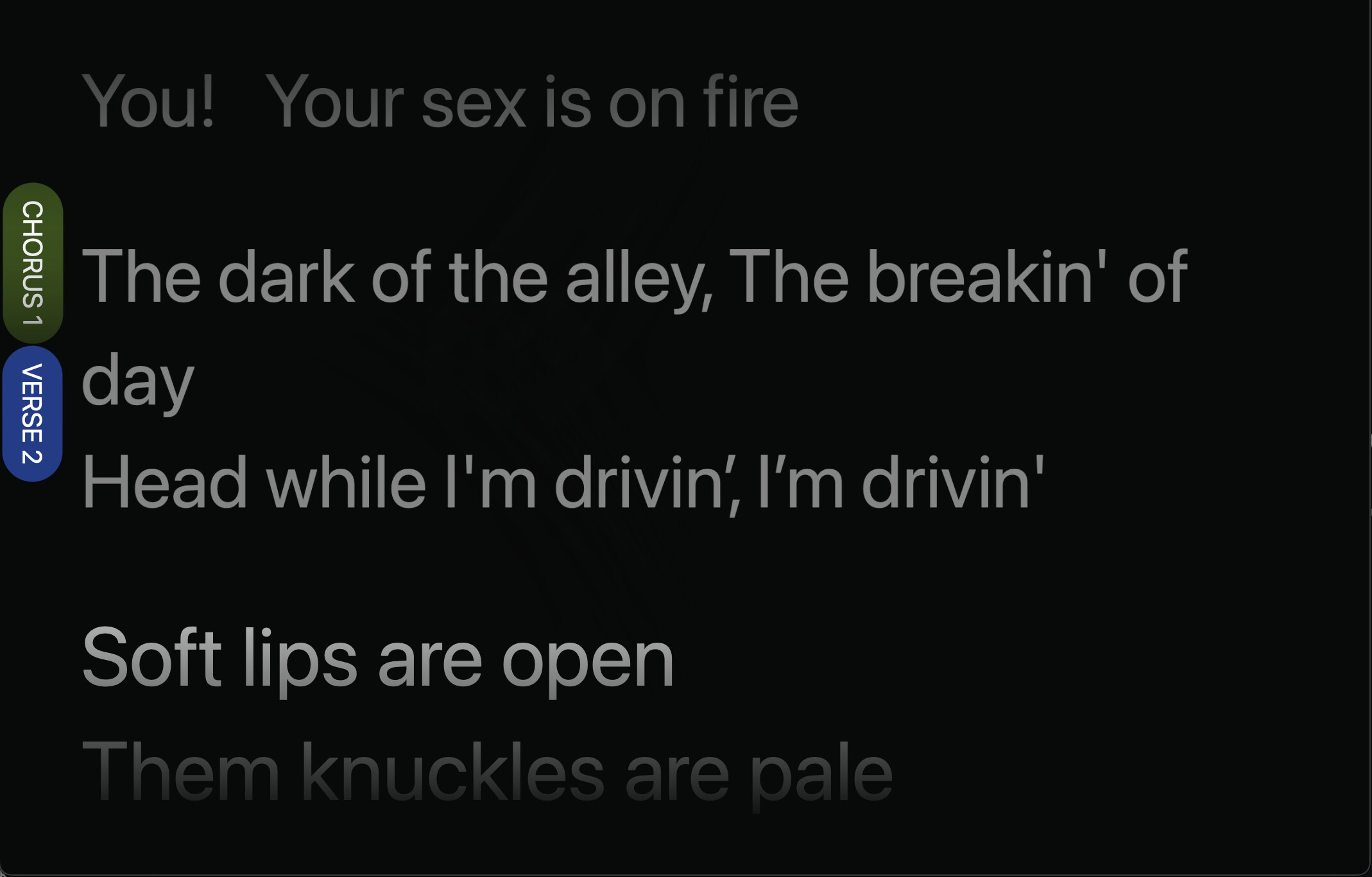
I would like to see the sections of the song listed on the side of the browser with the lyrics centered.
This would let the viewer know what we are in the verse, for example, even if there are a lot of words.
currently its a bit jarring when the section title jumps up the screen to reveal the first lines of the section.
You might be able to achieve this with the performance page. If you add the [nosections] attribute to your lyrics track, all section headers are hidden from the lyrics.
You can then go to the performance page and activate the lyrics component in its settings. The page should look something like this then:
hey Leo - this is a cool forum. I am thinking I’d like the simplest view possible for the vocalists and to maximize the real estate of the lyrics
The big idea is to avoid the jumping section headers and allow the the vocalist to see upcoming sections by giving back the vertical real estate by placing the section titles in the margins.
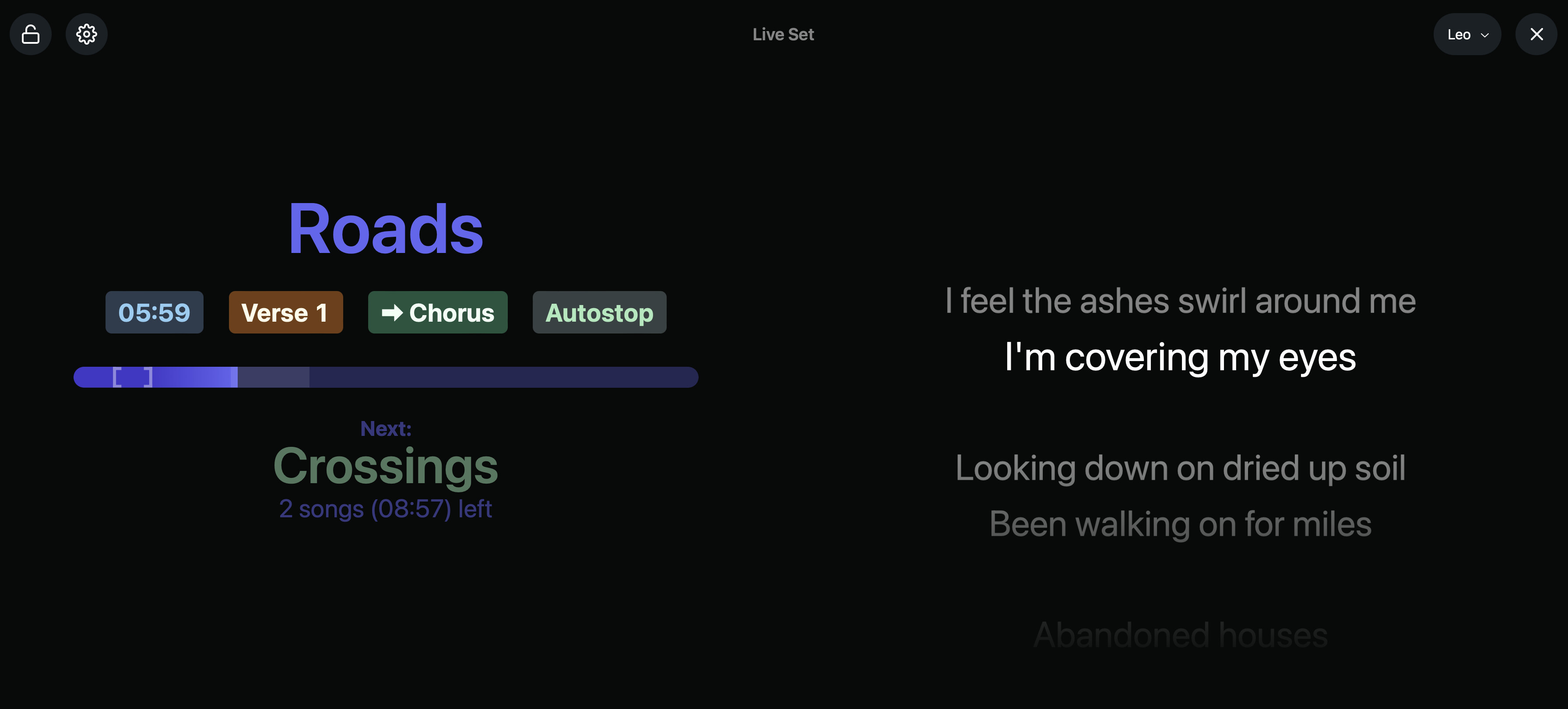
I’ve included the song map at the top as that is a cool way to see where you are in the song
@leolabs, what would be the necessary CSS to make the section tags smaller? I have a lot of sections per song and they just stack up on each other like a traffic jam.
Mainly, since this might not be a feature everyone would like to use, I’d have to start thinking about per-device lyrics settings, similar to the performance view settings. This might take a while to implement properly, and the feature itself would be more than just a few lines of CSS.
In terms of the layout, I like your suggestion. The only thing I’m not sure about is how to handle long song titles in the header. “Song Name” is fairly short, and it’s not unlikely to have song titles like “Nothing More Than That” which, if displayed completely, would make the progress bar fairly small.
The song title could either be hidden completely to work around this, or it could be on its own line, above the progress bar.
I’ll move this topic to the Feature Requests category so others can vote on it and chime in with their feedback as well.
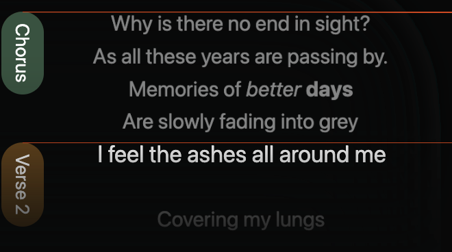
This is getting close although 1- the heading starts after the first line of the section and 2- I would like to add some more padding to the left side of the lyrics section.
For 2 I added this css to include padding to the left of the lyrics so they weren’t jammed into the section names.
p.sc-hHTYSt {
padding-left: 20px;
}
For issue 1 the sections should align with the top of the first line of tex
I’ve just tried to reproduce the positioning issue on my end, but I only experienced a slight shift that I could fix by slightly adjusting the top property. This is the code I used:
.lyrics-page .line:has(.section) {
  z-index: -1;
  position: sticky;
  top: -5vh;
  height: 0;
}

.lyrics-page .section {
  position: absolute;
  justify-content: start;
  margin-left: var(--font-size);
  height: 0;
  top: calc(var(--font-size) * 0.2);
  transform: rotate(90deg);
  transform-origin: left;
}

/** Red line for debugging purposes. Remove when done. */
.lyrics-page .section:before {
  content: "";
  display: block;
  position: absolute;
  left: 0;
  bottom: 0;
  height: 1000px;
  border-left: 1px solid red;
}

/** Give lines a bit of padding to the left to make space for sections */
.lyrics-page .lyrics-line p {
  padding-left: var(--font-size);
}

.lyrics-page .section h3 {
  box-shadow: 500px 0 100px 500px var(--color-background-deep);
}
I’ve also added some left padding to the lines as you did, but using relative sizes so they scale correctly with the window width, and a red line as a kind of ruler to test the alignment.
This is what it looks like on my end:
Could you try these styles and report back on whether they worked? If they don’t work properly, could you send me your entire styles.css file and some information on which browser and OS you’re using?
Thanks for the update. Some improvements for sure. css below
I am using Chrome Version 114.0.5735.198 (Official Build) (x86_64) on Ventura 13.4.1
A few ideas to consider
0. Our singer prefers blocks of text rather than karoke style - line by line so I am using “\” to separate lyric lines within each midi clip. this may be what’s causing my formatting issues/
the song title is getting styled the same as the sections. would be good to distinguish the two
The first line of the lyrics in the section don’t always line up.
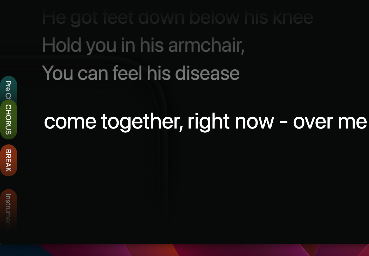
sections run into each other. Suggestion - Once a section is displayed, hide it (e.g. I don’t need to know /see Pre-Chorus and I would rather have the real estate to look ahead in the song
I would like to see the "Pre Chorus section tab scroll off the screen vertically after the pre-chorus section is displayed. this would help avoid the section buttons overlapping
Yes it works better. thanks. What is the CSS to move the lyric display closer to the top of the browser? now the lyrics are rendered mid-screen. would be nice to slide the whole thing up so the upcoming lyrics can also be seen
Hey @humbuckr, please excuse my late reply on this! AbleSet now has a [top] attribute that you can add to lyrics tracks to align the current line at the top of your screen. You can also specify an offset, e.g. [top+1] to have one previous line visible before the current one.